
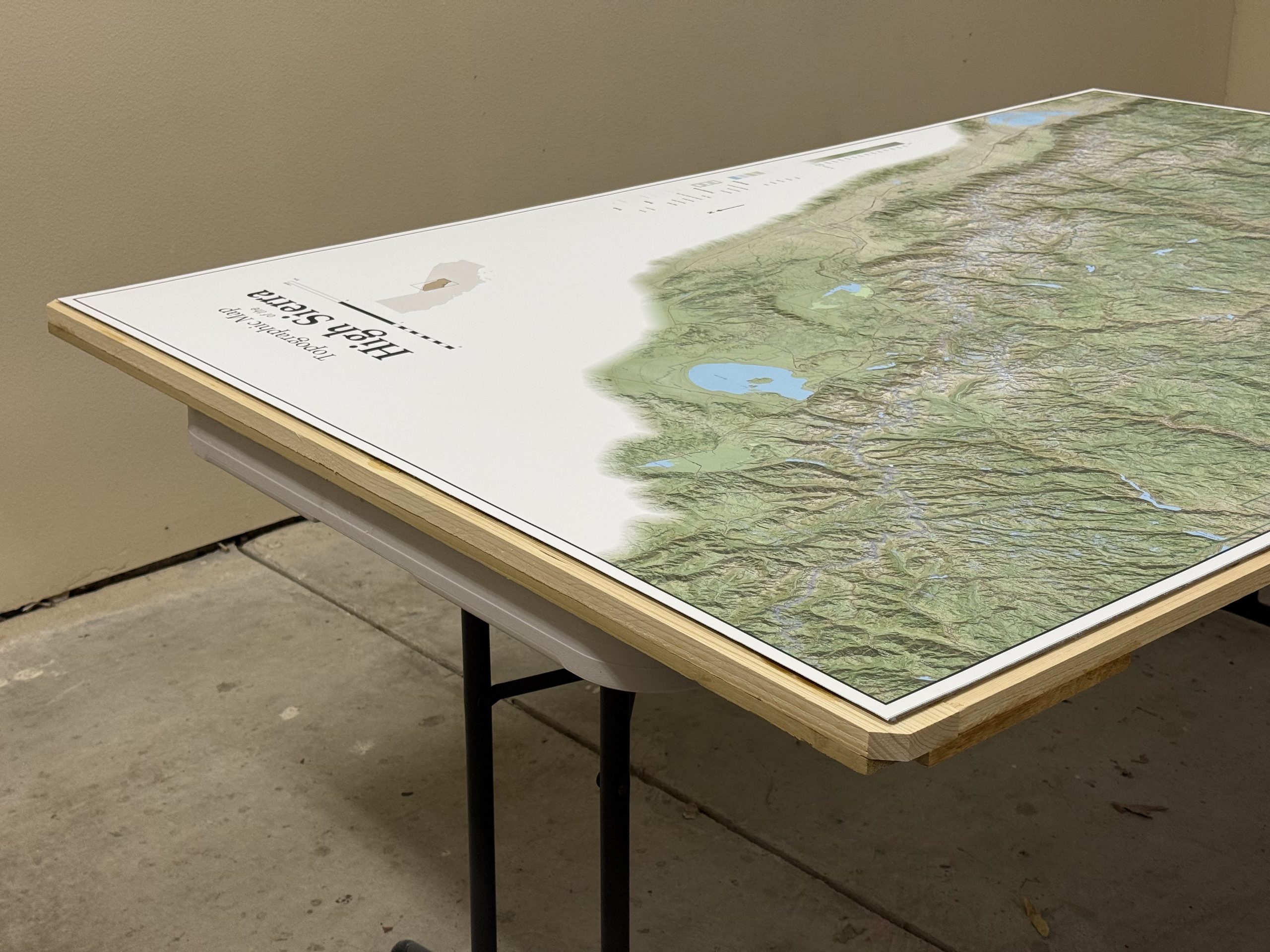
For years, I had been dreaming of making a map of my favorite mountain range, a map that is detailed enough to see separation between each campsite between days, where a few miles apart shows up distinctly, rather than a single point. So, where do I begin? The most dramatic part of the High Sierra is the southern half, concentrated around Sequoia and Kings Canyon, including the Inyo National Forest and its wilderness areas, and then it peters out around Yosemite.
First, a video of the project, from start to finish.
Where did I begin? I asked Claude.ai to help me, and in doing so, I learned to use QGIS, downloaded tiles and layers from the USGS, and manipulated them. With Claude’s help, I merged tiles, generated raster files, extracted DEM (digital elevation model) to create new contour lines, and added hillside shading. Then, I grabbed place name labels, shapefiles of the various regions (national parks, forests, wilderness, watersheds), roads and trails, and hydrology flow lines. Using Python code, Claude and I styled these elements and layered them onto the base map.
Link to my conversation transcript with Claude.
My initial ask was to generate a 30″ x 60″ map, but after playing with the scale, it ended up being 48″ x 72″. The most tedious part of the project was adjusting things in print layout, carefully going over every square inch of the map, checking for label collisions, and moving things where needed.
Once printed, the hardest part was on the mounting. I wanted it magnetic, so the most challenging task was gluing the map on the steel sheet without any wrinkles. I had one chance, and it had to be flawless.
The completed project was fun to frame and hang.


